How to avoid ‘jaggies’: Turning on Anti-aliasing
When creating a flyer or business card design in Adobe Photoshop, it is very easy for beginners to forget to perform one very important step — to turn on anti-aliasing to smooth the text.
With all the other steps involved in creating print ready data (setting up the document size, making sure you are working in CMYK color mode and at 300dpi resolution etc.), making sure your fonts are smooth and don’t have jagged edges is easily overlooked. On screen you may think it looks okay, or that it is just the screen making the fonts appear a little rough (and it will look okay when it’s printed) but unfortunately, it will also print just as it appears.

So, to fix these nasty jaggies, we must turn on font smoothing or anti-aliasing.
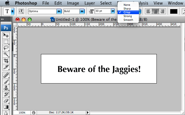
The anti-alias select menu is found next to the other basic font settings at the top of the screen (in CS2 or CS3), when your text is selected or active. Anti-aliasing is set on a per text object basis, so you cannot mix and match settings in one text area.
There are 5 different settings to choose from: none (or off), sharp, crisp, strong and smooth.
Which one you select depends on personal preference, font size and whether you are working on a design for web or print. Experiment to find the setting that best suits your design.
Note: Some times a designer may purposefully not want the fonts to appear smooth, to simulate the appearance of fonts in a web browser etc., in this case selecting none can be handy.
Selecting crisp in this case gave the best result.

There you have it, no more excuses for sub-standard text. It must be said however that for the best printing results, setting type in Illustrator is always the way to go, as it uses vectors rather than bitmaps to render the fonts.


