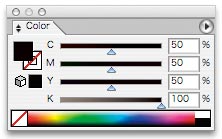
Back in Black
When designing in greyscale mode – ie only using shades of black ink, 100% black will give you the deepest black color possible. But…should you be designing for a full color, CMYK project, then you have the choice to go beyond black and into the realm of rich black. Indeed, you may regret it if you don’t…
100% K for text is Good. 100% K for solid objects is Bad.
Where CMYK printing is concerned, Specifying 100% black ink is fine for text, but if you want to cover fairly large areas in black then you need to be aware of the overprinting phenomenon.
Specifying 100% K (ie no other C,M or Y inks) will result in the object being overprinted. This is standard practice within the industry and is carried out to ensure that text is always legible (by avoiding trapping). This is sometimes unwanted however as it will show through whatever is below – as if it were transparent. To overcome this and force the black area to appear solid and knock out whatever is behind it, we need to specify a black that contains at least 1% of one other ink.
Rich Black
For the deepest black we can specify super black or rich black (or solid black).
Rich black is a combination of all 4 inks overprinted to give a denser impression of black. Just black ink on its own is just one layer of ink you understand. Stack four layers on top of each other and you get solid black. But, you cannot specify 4 layers of black ink as there is only one plate per CMYK color. So, you must mix 50% of the Cyan, Magenta and Yellow inks together with 100% black. Try it on your next project and compare the results – now that is black!


